

TL;DR: Building my image plugin took testing and a change in what I compared: illustration style and color, instead of composition. The payoff is consistency, with less frustration and time saved. For me, the setup was worth it because the work repeats.

One less thing to concentrate on
Many years ago, I learned to drive on a big old station wagon with an automatic transmission. It was a family car. I didn't have a choice. It's what I learned to drive on.
Then early in my marriage, my husband owned a stick shift, a five-speed, which I had no idea how to drive. It was a challenge to say the least, but I needed to know how to operate it because it was now the family car.
For me, it was difficult because of the coordination. You had to shift gears. You had to press the right pedal. If you got on a hill, it was even harder.
But in order to drive, that's the car that I had available most of the time, so I didn't have a choice.
When I first started to learn to drive the five-speed, my husband took me to Presque Isle in Erie. It was just straight open road, and there was one turn. I almost killed a few people when I made that turn. I made it so fast, and because I had to concentrate on shifting, it just threw me all out of kilter. But that's part of the learning process.
Then automatic transmissions became more commonplace, so when it was time to replace the family car, an automatic was my first (and only) must-have.
When I got in to test drive this new car, I didn't have those worries. Get in, turn on the car, put it in gear and go.
And what a game changer that was. Instead of concentrating on shifting gears or making sure I didn't grind the gears out, I had better concentration on the road and my surroundings. So not only was it easier for me, it was probably safer for me too.
So it was the same scenario with a different set of problems. I mean, I needed to learn where everything was in the car, but I had one less thing I had to concentrate on.
Building my image workflow felt a lot like that. Getting it set up took real work. But now, when I create images, I can put my attention on what the image needs to say.
✳︎ ✳︎ ✳︎
If you read DigiNav Compass Signal, you’ll stop second-guessing your AI and automation decisions because you’ll have a way to tell what actually fits your business from what’s just noise.
Today, I’ll be showing you what it took to get my illustration style working in one image workflow, what I was getting wrong in my testing, and how to tell whether that kind of setup will pay off in your own recurring work.
✳︎ ✳︎ ✳︎
Two apps, one set of images
For a while, my images came from two places.
The foundation of my illustration style came from Midjourney. That wasn't a waste or a mistake. Midjourney is where that distinctive style developed.
ChatGPT was getting better and better with image creation, and my digi-girl character looked consistently the same. Also gone were the random men that were dropped into almost every image. But still, Chat could not create the illustrative hand-drawn look it took me so much time to get right.
Meanwhile, the images kept coming due. Articles, social posts, promotions. Each one meant moving between two apps to get one set of images.
Then two things happened. Chat caught up in image creation and matching the style that Midjourney now created so easily, and I started using Amplifiers MCP, a collection of curated prompts and image tools (thanks to Daria Cupareanu), which helped me to refine even more.
It was time to stop using two apps if one could meet the needs. That's what led me to build my DigiNav image plugin in ChatGPT.
Maybe you have your own version of this: a task that keeps coming back, split across tools that each do part of it well.
What to think about: what "right" looks like before you build
The hardest part was getting the illustration style correct.
I knew it wouldn't be exact. But it needed to be more than close enough.
The trouble with "close enough" is that it's hard to fix something you can't name. A test image could have my character, a good scene, even nice colors, and still not look like mine.
So I had to get specific about what made my illustrations mine. Once I did, the look came down to a few things:
one focal subject that's fully developed
surroundings drawn mostly in gray
color used selectively, only where it matters
open paper left inside the drawing, so it still feels hand-drawn
That became the rule for every illustrated format in the plugin. Feature images, scenes, sketch notes. Every one starts from the same drawing reference and gets checked against it before I see it.
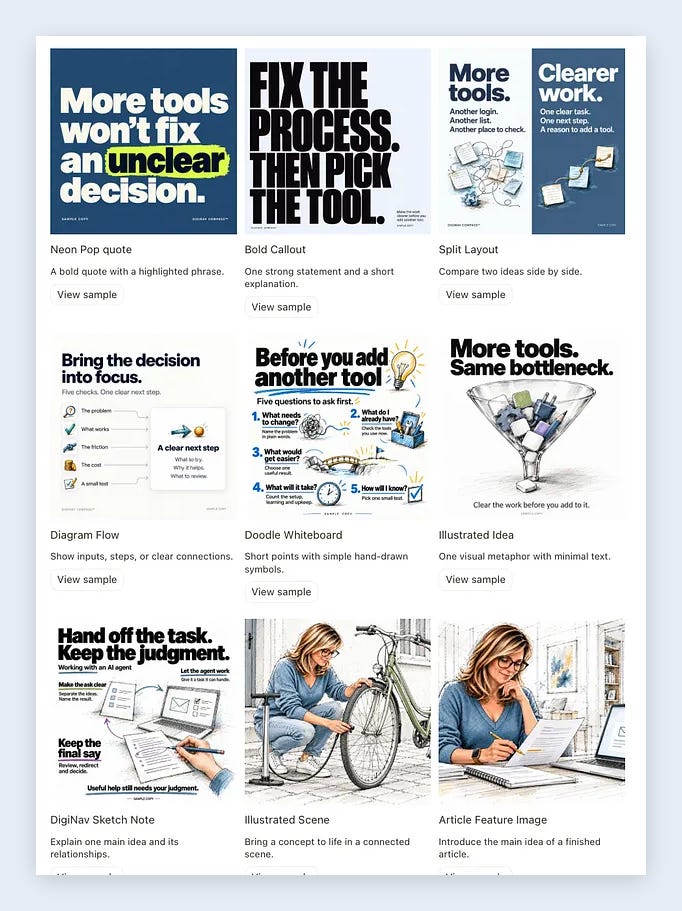
That's where the payoff comes from. Less frustration and better time savings, but most importantly, consistency.
Before you set up a workflow for a recurring task, it helps to know what "right" looks like, specifically enough that you could describe it to someone else. It doesn't have to be exact. It has to be clear enough that you can tell when a result is more than close enough, and when it isn't.
What can go wrong: comparing the wrong thing
When the test image didn't look right, I started back at the beginning. I asked for a prompt to put in Midjourney, knowing that the style would be what I needed. Then I asked Chat to recreate the best of the bunch.
But that didn't help, because I was still looking at the wrong problem.
Focusing on composition was where the big miss happened, because the problems weren't in the layout. One colored the whole room too evenly and added plants. Another put the same scratchy texture over everything. When I asked for the linework and color to be built in from the very first prompt, the next test came back with more paint and more splatter. My reply was "WORSE NOT BETTER."
That's when it hit me: we need to work on details and not the way the image was laid out. And by details I meant color application, line style and weights. Even the order things got added, to create the layered style Midjourney is known for.
I ran test images from the same prompt and compared the illustration style and color application.
I even went to Gemini, knowing it was good with images, comparing two images on color treatment only. With a simple prompt and the two samples, I asked, "What is the difference in color treatment only of these images?" That was all the answers I needed. Keep the background in gray and put color on the main subject and a few accents. That was my style.
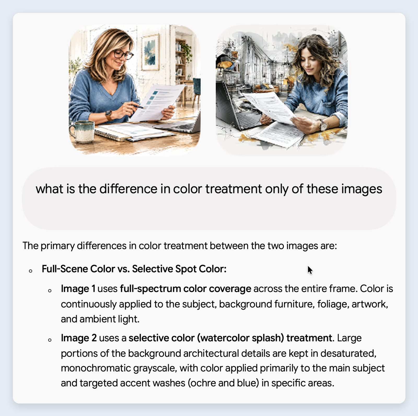
The difference was never where things sat or the objects themselves. It was where the color went and the details of the lines. So instead of every sample coming back with something slightly off, I now had a name for it and a set of application rules.
If a result comes back that feels a bit off, it's worth taking some time to name what's actually wrong before motoring on. Otherwise you can spend a lot of tests fixing parts that don't need fixed.
What comes next: consistency across the work that keeps coming back
Once the style had a name and a set of rules, the plugin started doing what I built it for.
I created three article image packages and only needed one revision. And that revision was mostly because the wrong style was suggested for the information and I didn't correct it.
That one revision tells me more information too. The plugin can get the look right and suggest layouts for the content given, but sometimes we need to make the final decision. That part is still my call, and an easy fix if needed.
Now creating images for articles, social posts, and promotions is worth the struggle it took to get here. Every new piece starts from the same rules instead of starting over, so the images look like they belong together.
Which makes the time it took to set up, and the consistency across images, well worth it. In those three packages, the color application was right. The one revision was about the style chosen for the information.
Worth the struggle
So, was building the plugin in Chat the right decision? For me, yes.
Midjourney wasn't a mistake. It's where my style developed. But once ChatGPT could handle the whole job, moving everything into one workflow was the right call for work I do again and again.
It wasn't effortless. It took a lot of testing, a lot of "close enough," and figuring out I was comparing the wrong thing. That setup paid off because the work repeats.
That's the question I'd ask about your own work. Which task keeps coming back and takes your attention every time? Do you know what "right" looks like for it? And would a more consistent process give you some of that attention back?
Here's something to try. The next time a result comes back "not quite right," ask about one thing only, the way I asked Gemini about color treatment only.
Kind of like driving an automatic. Get in, put it in gear and go.
Coming to the perks: my image system
I'm making a downloadable version of my image system for paid subscribers, with setup for your own brand and visual style.
You'll be able to add your colors, fonts, logo, and reference images, then use the templates to create images for your content.
It's still in development but will be part of the Subscriber Perks. I'll share the download and setup guide here when it's tested and ready.